Grab your favorite drink, get yourself comfortable and get ready to visit the wonderful world of landing pages!
Landing pages are a crucial element of any successful marketing campaign.
They are designed to convert website visitors into leads or customers by providing a focused and compelling message and an easy path to action.
However, simply creating a landing page is not enough. It needs to be well-designed to achieve the desired results.
In this post, we’ll discuss how to build a landing page for marketing campaigns that is effective and engaging.
Why a Well-Designed Landing Page Matters
A poorly designed landing page can have a negative impact on your marketing campaign. Here are some statistics to back this up:
- A one-second delay in page load time can result in a 7% reduction in conversions (Source: Neil Patel).
- 38% of website visitors will stop engaging with a website if the content or layout is unattractive (Source: Adobe).
- 64% of marketers say that landing pages are the most effective way to test the value proposition of a campaign (Source: Marketo).
- A/B testing can increase conversion rates by 49% (Source: Invesp).
Key Elements of a Great Landing Page
To create a well-designed landing page, here are some key elements to consider:
- Headline
Your headline is the first thing visitors will see, and it should immediately grab their attention and communicate the value proposition of your product or service. Keep it clear, concise, and benefit-oriented. 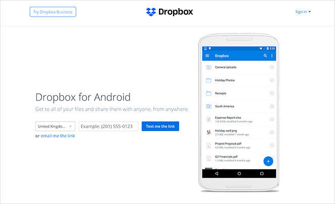
The example here from Dropbox is clear, easy to understand and speaks directly to the service they provide.
- Hero Image or Video
Your hero image or video should complement your headline and support your value proposition. It should be visually appealing and relevant to your product or service.

Slack’s example highlights a simple hero concept, not too cluttered but concise. It’s on brand and also clearly demonstrates the design aspect of the service.
- Clear Call to Action (CTA)
Your call to action should be prominently displayed and clearly communicate the action you want visitors to take. Use action-oriented language and make it easy to find and click.

Hubspot relies on Calls to Action to measure engagement with their tracking systems, so it comes as no surprise that CTA’s are used very well on their sites. This example shows how the flow of information leads directly to the CTA, leaving a visitor with no doubt what the context of the CTA is.
- Social Proof
Social proof can be a powerful motivator for visitors to take action. Use customer testimonials, case studies, or trust badges to build trust and credibility. Here’s an example from Hatchbuck:
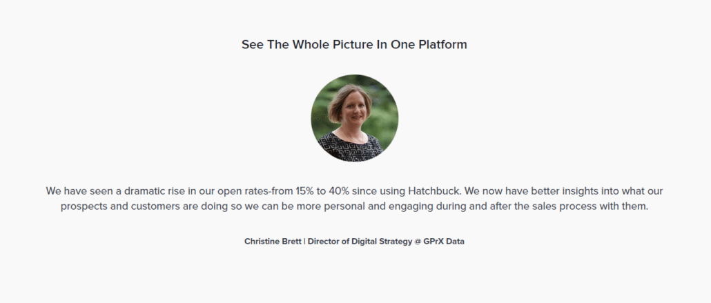
Hatchbuck has a slider of reviews, which we recommend for most of our clients. You can use reviews from multiple platforms like Google, TripAdvisor, Facebook and more and have them stream onto the website, or just select your favorites. Reviews on independent platforms like Google tend to lend more weight than testimonials, which can be perceived as cherry-picking only the positives.
Written references from key clients can be double-edged, as they can have a lot more detail, but that detail may be too much.
The key to social proof is to demonstrate a consistent product/service via your customers in a way that reassures visitors to your landing page.
- Simple Forms
If you’re collecting information from visitors, keep your forms as simple as possible. Only ask for essential information, and make sure the form is easy to fill out.
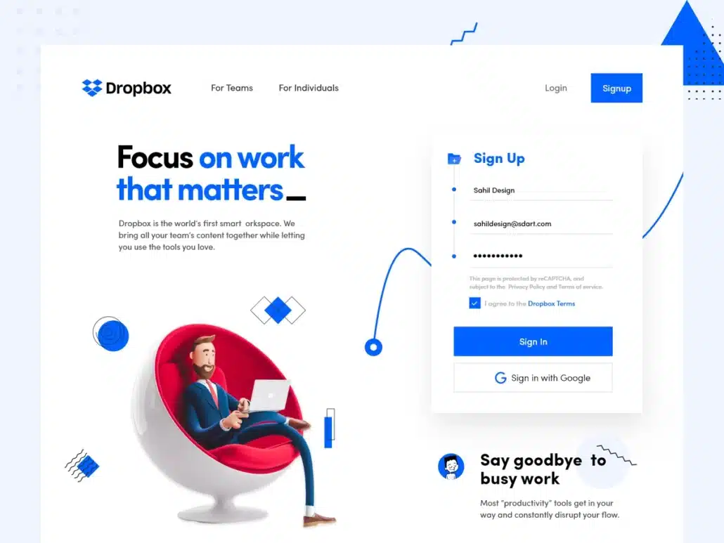
Dropbox has designed a very good form with the bare minimum of information but also offering the simplicity of using a Google login.
Allowing people to use logins from Google, LinkedIn, Facebook or other platforms has the benefit of getting data from the accounts whilst providing visitors a very simple way to connect. The data will be heavily redacted to maintain privacy, but more data means better marketing. That said, it wouldn’t be acceptable for some businesses which might need to build a greater level of trust before using alternative forms of completing a form.
- Mobile Optimization
Make sure your landing page is optimized for mobile devices, as more and more people are accessing the internet on their phones. Use a responsive design and test your page on various devices to ensure a smooth experience.
Additional Tips for Building an Effective Landing Page
Here are some additional tips to keep in mind when building a landing page:
- Keep it simple and focused on one goal.
- Use clear and concise language.
- Use contrasting colors and typography to draw attention to key elements.
- Use white space to make your page easy to read.
- Test and optimize your page regularly to improve conversion rates. A/B testing by splitting your traffic 50/50 between two pages is an effective way to test which page works best.
- Have really good tracking on the landing page. Don’t rely on just Google Analytics, try other tools like Delve, TruConversion or other tools which capture much more data and help you make data-driven decisions.
Conclusion
A well-designed landing page is crucial for the success of your marketing campaign. By following the key elements and tips outlined in this post, you can create a landing page that effectively communicates your value proposition.